

What are the polar ice caps telling us?—Part II
What ‘Climate Emergency’?

In Part I, I examined the evolution of “sea ice extent” in the Arctic over the entire course of satellite surveillance. Part II concentrates on sea ice extent in Antarctica.
Sea Ice Extent around Antarctica near its 2013 maximum:
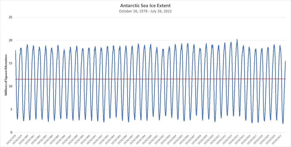
Let me recount the results of Part I: Satellite surveillance runs from the middle of 1978 to the present. Satellite surveillance vividly demonstrates the great range of sea ice extent over the course of a year. The annual maximum would amount to about three times the volume of ice that the Arctic maintains at its annual minimum. Annual minima and maxima can change appreciably from year to year, but, over the last fifteen years, sea ice extent has not systematically changed. It’s gone down in some years. It’s gone up in others. But, on average, the change from year to year is statistically indistinguishable from zero. The Arctic is not signaling any change in the climate much less a Climate Emergency™. Here’s the picture again.

The linear trend has a slope that is statistically indistinguishable from zero. So, don’t believe the hype.
Meanwhile, here is what oscillations in sea ice look like in Antarctica from 1978 through July 2022:
Again, the red line is a linear trend. I estimate it by regressing sea ice extent against time. That line actually has a small positive slope, although it is also statistically indistinguishable from zero. Thus, it is hard to conclude that sea ice extent has been either growing or shrinking since 1978. But, if one were to casually survey the time series, one might discern intervals of a few years during which sea ice extent appeared to be growing and others in which it had appeared to be shrinking. Suppose, for example, that one were to strategically choose the interval July 27, 2014 through July 26, 2022. That interval would capture the conspicuous peak in maximum sea ice extent in 2014 and the obvious decline in the maxima over the succeeding few years. What happens when we estimate a linear trend for that interval?
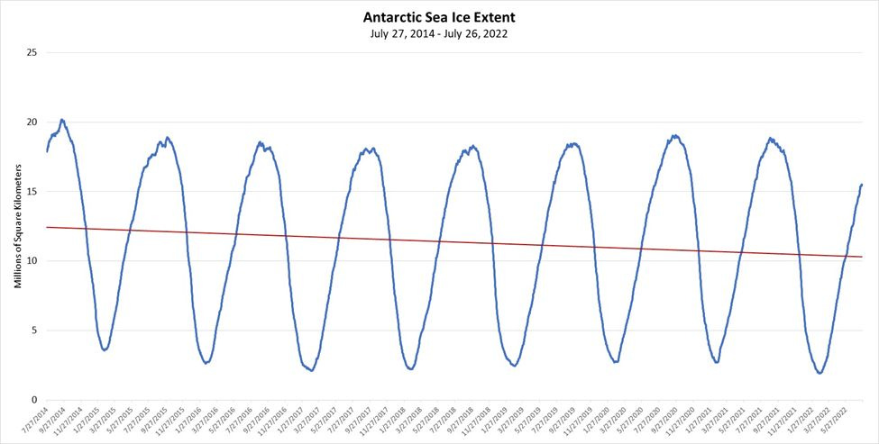
The linear trend exhibits a negative slope of 0.0004651 million square kilometers of ice melt per day. (The result is statistically significant at the 1% level.) That amounts to an annual decline of nearly 170,000 square kilometers a year (or 65,000 square miles per year). The sea ice around Antarctica has the appearance of shrinking.
Note that, were we to concentrate attention on the judiciously selected years 2008-2014, then we would observe sea ice growing at a rate of nearly 390,000 square kilometers (150,000 square miles) per year. That amounts to area equivalent to about 142 Rhode Islands a year... Meanwhile, there is some understanding that the earth had been cooling from about 1940 to 1980. Had sea ice been increasing during that time? Alternatively, had it also appeared invariant to the cooling just as it has appeared invariant to warming over the last 30 years?
Bigger question: So what?
The ice waxes and wanes. Sometimes it grows over a sequence of years and then recedes over a sequence of years. But, what does any of that reveal about the warming or cooling of planet over the next 100 years? 1,000 years? 10,000 years? Anything? And, even if it did reveal something about the warming or cooling of the planet, should we be concerned? Indeed, there’s a question: What is the optimal temperature of the planet? 13.6649 degrees Celsius? 13.6651?
Meanwhile, newsflash in geological time:

Ah, well. Scientists have been measuring the waxing and waning in what amounts to a snapshot in geologic time. The waxing and waning are manifestations of chaotic, dynamic processes … meaning processes that can be difficult to predict more than a few years out. And, yet, there seems to be that temptation to project short term trends linearly: If we observe “sea ice extent” decreasing, then we’re doomed, clearly. But, if sea ice extent increases? … No worries?
Linear projections are all well and good, but much more cinematic are threshold effects, “tipping points,” knife-edge conditions. Indeed, complex dynamic processes do sometimes spin off into wildly different equilibria no matter what we do, but the prospect of tipping points provides the journalist with more opportunities for hype:
Right now, the [Ross Ice Shelf] works like a giant bottle-stopper that slows down ice trying to flow from the land into the sea. If it collapses, the ice could flow into the ocean more rapidly, an effect that has already happened on a much smaller scale in other areas of Antarctica.
The most vulnerable parts of the West Antarctic ice sheet could raise the sea level by 10 to 15 feet, inundating many of the world’s coastal cities, …
That passage comes from this piece:

The New York Times piece features beautiful images. Awesome. I recommend scrolling through them. Stunning. But, yes. One does not have to submit to the obvious gaslighting.
Here is a record of scientists and their running-dog lackeys (走狗) in the New York Times dutifully documenting noise over the course of a blink of the eye in geologic time in a chaotic, dynamic system:
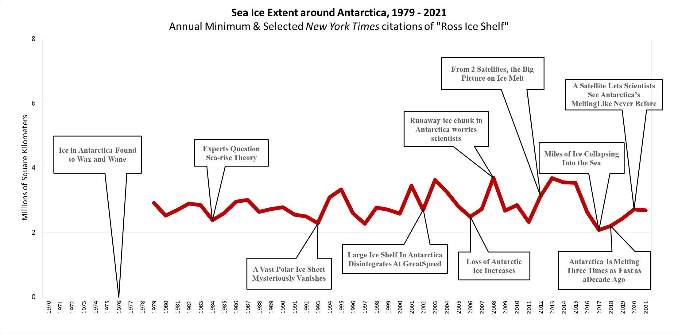
The red line indicates the annual minima in sea ice extent in Antarctica going back to 1979. Obviously, we’re doomed, because Climate Change™.
In the beginning (in 1976), “Antarctic [Ice] Found to Wax and Wane.” But, even then, the threat was imminent:
Dr. Terence J. Hughes of the University of Maine believes that if the ice becomes buoyant much farther inland than at present, the entire Marie Byrd Land ice sheet will ‘disintegrate, raising the seas some 20 feet.
Undoubtedly, the dynamic system that generates sea levels is informed by threshold effects. Over time measured on a geologic scale, seas have risen 90 meters or dropped 90 meters. Or, like now, seas have risen less than 2 millimeters a year over the course of the last 12,000 years. But, does any policy-relevant information come out of this? Is this business of seas-could-rise-20-feet—over what? a few centuries?—really inform how humanity might manage carbon emissions? The gaslighting is obvious.
The media has obviously concentrated its reporting on the annual minimum extent of sea ice in either the Arctic or around Antarctica. They report nothing about annual maxima or average sea ice extent. But, here is what we see in the satellite data, which extend back to 1978:
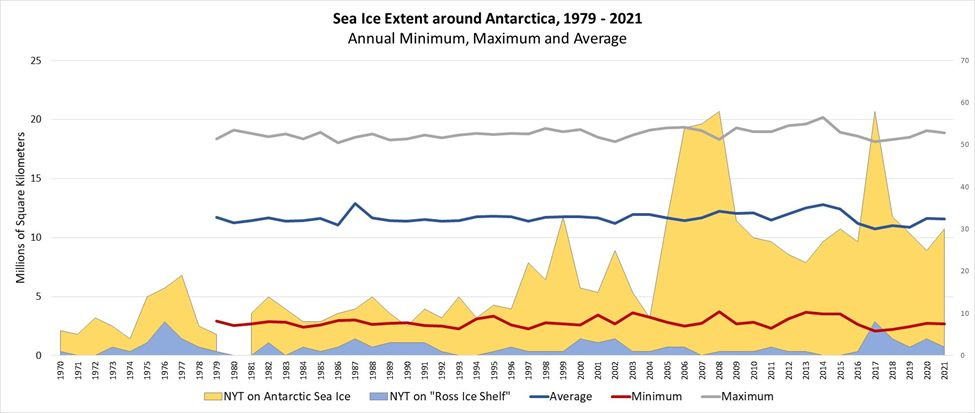
This graph indicates the maxima in Antarctic sea ice extent (gray line), the average in sea ice extent (blue line), as well as the minima (red line). The graph also indicates the annual frequency of New York Times citations about “Antarctica” and “sea” and “ice” (the yellow area) and “Ross Ice Shelf” (the blue area).
Journalists love to report about the Ross Ice Shelf, especially starting in the late 1990’s. As I have indicated before, one can easily find pieces about how ice bergs large than the state of Rhode Island have broken off the Ross Ice Shelf. The gaslighting suggestion is obvious: a big piece of ice has broken off; the Ross Ice Shelf is suddenly disintegrating; this is a consequence of Climate Change™; the planet is warming; we’re doomed; stop all carbon emissions now.
It's so wearyingly stupid and juvenile.
The seas may rise 20 feet or 20 meters at some point. But, good luck tying any of that to human activity. And then they might fall 90 meters to where they were 20,000 years ago. Meanwhile, I leave you with this one rare specimen of adult supervision in the New York Times record. From 1984:

The seaward edge of the shelves breaks off into icebergs. Should this process accelerate, specialists believe it could drain much of the ice from West Antarctica in a matter of centuries. Hence, in the last few years, there have been extensive studies of the ice cover.
Dr. Ian M. Whillans of the Institute of Polar Studies at Ohio State University said these studies had revealed no ''dramatic'' changes either in West Antarctica or on the Ross Ice Shelf. He cited various ''catastrophic hypothesis'' regarding that ice and added, ''Perhaps we should also consider the possibility that it is stable.''
There appeared to be a consensus that too little was known about the factors controlling growth and shrinkage of the ice sheet to predict its response to warming. ''The more ingredients you put into a cake,'' said Dr. Thomas, ''the more ambiguous it gets.''
Another interesting look at the data. I keep waiting for that tipping point that never seems to arrive. I am always stunned at the power of nature to pretty much undo whatever we have been doing. Entire civilizations buried by time and nature. The power of a single volcanic eruption to blot out the sun for long periods. And humans continue to adapt and evolve.
A few years ago I read a book called "How Not to Be Wrong" by Jordan Ellenberg that explored a few of the ideas you mention about looking at trendlines. However, based on the examples he used in the book, I suspect he wouldn't approve of how you are employing these techniques. Ha ha.