
Today I stumbled upon a piece that argued that Sweden had “got it mostly right and showed the world that lockdowns did absolutely nothing to save lives, but rather, cause catastrophic pain and deaths.” The following graph was posted as support for the proposition.

I’d be lying were I not to admit that I am sympathetic to the basic proposition, but motivating it requires much better work. The idea here seems to be that Sweden experienced way lower excess mortality from beginning of 2020 through to May 1, 2022 than each country in a seemingly representative set of other countries. Where, for example, Brazil racked up nearly 800,000 excess fatalities, Sweden racked up hardly over 10,000. Sweden even has the appearance of out-performing lockdown-heavy Germany.
What is missing here? Indeed, where to start? It should be no surprise that countries with smaller populations would tend to rack up fewer excess fatalities than larger countries. But, we can control for differences in population by examining excess fatalities per 1,000,000 people in the population. Indeed, we can draw up a graph from the same source, Our World in Data (ourworldindata.org), that does just that:
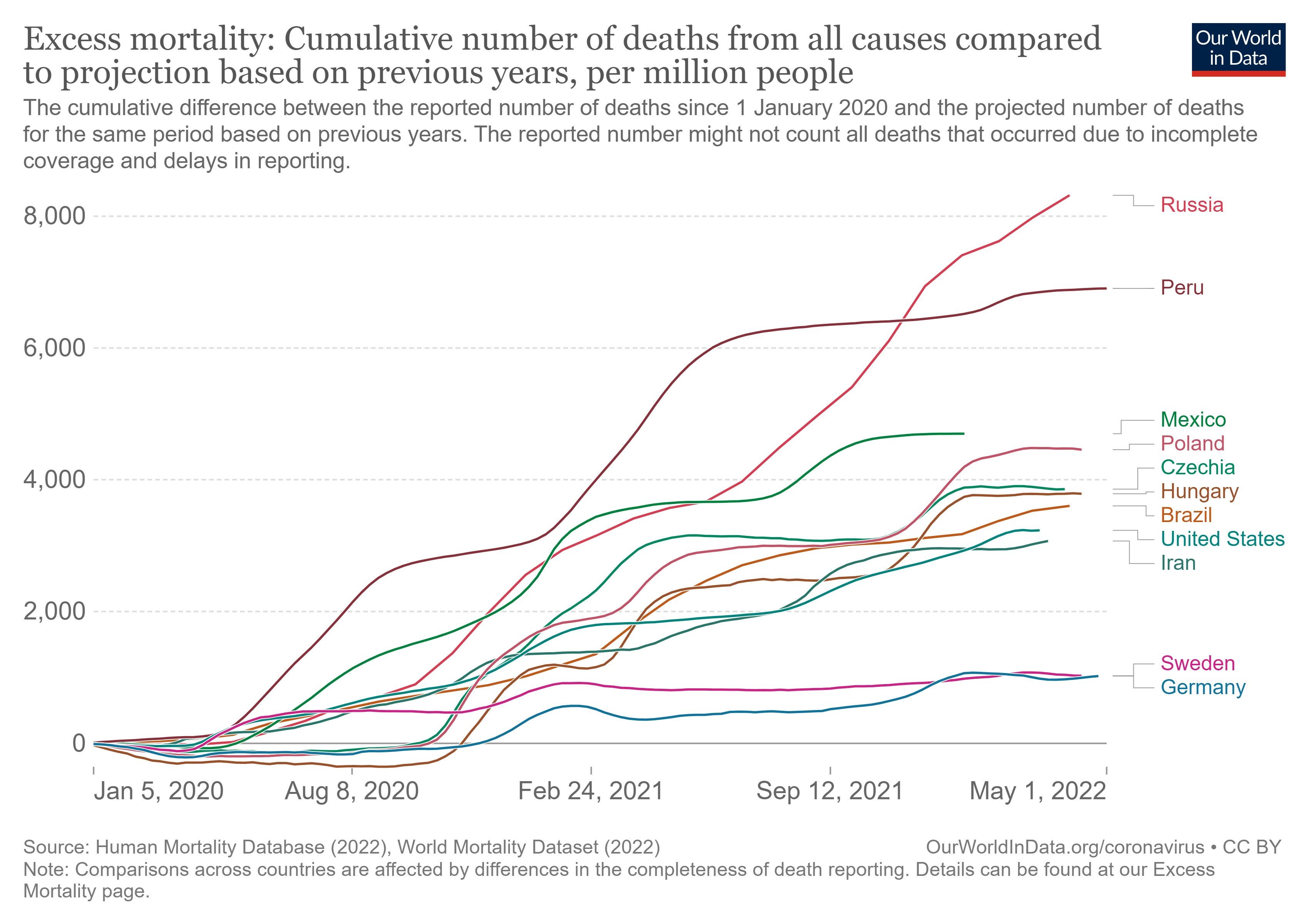
In this graph, Germany and Sweden run about even as of April 2022. Germany had the appearance of outperforming Sweden most of the time, but by the beginning of 2022, it began to rack up excess fatalities. So, maybe there is a point to make here: Lock-down heavy Germany appears to have performed no better than lockdown-light Sweden. And Sweden will have spared itself the collateral damage that attends strict “non-pharmacological interventions” (NPI’s). But, there is something missing here. We can yet find lockdown-heavy countries, such as New Zealand, Australia or South Korea that yet have the appearance of outperforming Sweden. And then there are countries like India that appear to have outperformed Sweden. Did India manage the coronavirus phenomenon better than Sweden and Germany? If so, what was their magic formula? Is there a magic formula?
Perhaps not. Perhaps there are important differences between countries in addition to population size that might help us to better understand why certain countries performed better than others. Certain countries, for example, support older populations. Older populations have proven to be more susceptible to coronavirus fatalities. Is there any way to control for differences in age distributions or other differences? One way would be to implement something in the spirit of a “fixed effects” analysis. Basically, instead of examining total excess fatalities by country (as in the first graph) or excess fatalities per unit measure of population (per 1,000,000 as in the second graph), we compare excess mortality during the coronavirus phenomenon as a proportion of total, expected, baseline mortality. We thus end up with excess mortality measured in percentage terms, not in terms of body counts. Hence the following graph:
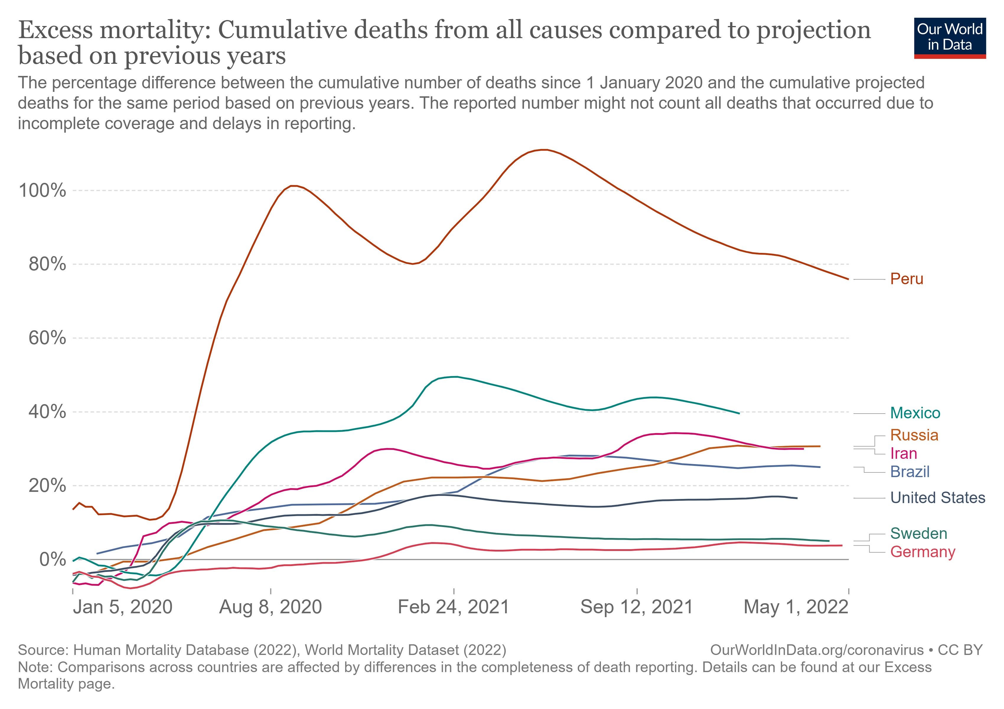
In this graph, both Sweden and Germany still have the appearance of performing better than other countries. Note, however, how much better that Brazil, Russia and the United States appear to perform relative to other countries.
I myself have periodically examined excess mortality by state in the United States. I’ve used data from the CDC, and after much slicing and dicing, have been able to generate graphs like the following:

This graph features the states of California, Florida, Illinois, New Jersey and New York. It also features “United States,” which amounts to a weighted average of performance across all states.
What do we see? The media celebrated the performances of California and New York, going so far as to award the governor of New York, Andrew Cuomo, a Television Academy Emmy Award for his performance. National Public Radio elaborated:
The governor earned plaudits for his early, aggressive approach to the coronavirus pandemic, which included a highly visible role as New York's briefer-in-chief. For several months earlier this year, Cuomo stepped in front of the news media each day with new statistics, a new PowerPoint slideshow and the same acerbic delivery. The regular briefings helped buoy his approval ratings in New York and make him perhaps the country's most recognizable Democratic leader in the struggle against COVID-19.[1]
The emphasis in italics is my own.
Meanwhile, the media castigated Florida governor Ron DeSantis for Florida’s lockdown-light approach to the coronavirus phenomenon. And, yet, by the end of 2021 both Florida and New York had been performing at just about the national average indicated by the red line labeled “United States”. Of the five states indicated in the graph, California ended up performing the worst.
I will update this kind of analysis in the future, but one must note two things about performance, as measured by proportional excess mortality, by state. Performance across states has broadly converged on the national average as COVID has burned through the population. The suggestion is that it is not obvious that diversity in NPI regimes has generated diversity in performance. Even so, there yet remains, as of the end of 2021, much diversity in apparent performance. Hawaii (not pictured) leads the pack with excess mortality of about 5%. So, did Hawaii find the magic formula? Is there a magic formula? Or did Hawaii contain infections merely by virtue of being so amenable to isolation?
One way to approach this question of magic formulas would be to conduct a regression analysis that regresses a measure of performance (proportional excess mortality) against measures of the stringency of NPI’s by state as well as against measures of state-specific attributes. That is the kind of exercise I endeavored to do with respect to countries, not states, in my previous Substack post, but the data (from Our World in Data and other sources) are not sufficiently rich and complete to support such an exercise.
That is a great shame. The reason is that an analysis that focuses on excess mortality gets away from fatal problems plaguing analyses that concentrate on other, ersatz measures of performance such as raw counts of fatalities attributed to COVID. As this essay goes to print, President Biden will have made a big deal of fetishizing the deaths, attributed to COVID, of one million Americans. But, what is wrong with using COVID fatalities as a measure of performance? One reason, broadly if not uniformly appreciated, is that COVID fatalities have not translated one-to-one into total mortality. The median age of death attributed to COVID has exceeded the median age of death attributed to plain old death. This has been consistently true over time in country after country. In Italy, for example, the median age of deaths attributed to COVID was 82 as of January 10, 2022.[2] As of December 16, 2020 the median age of deaths in Italy attributed to COVID was … 82![3] The reality is that COVID has largely taken away people who were likely to be soon taken by other conditions.
But, this does raise a big puzzle. Excess mortality in the United States and elsewhere has remained elevated, and one cannot attribute the official counts of COVID fatalities to much, or even most, of the continuing excess mortality. So, what is going on?
It is hard not to conclude that NPI’s and other policies, and not coronavirus fatalities themselves, have generated much of the continuing excess mortality. Indeed, as I’ve explained in earlier posts, much of that non-COVID excess has been concentrated on young people—sometimes on very young people. (See, for example, “Proposition 5” in this post.) What is going on there?
The fact that the coronavirus phenomenon has involved complex things far in addition to COVID itself is why I label it the “coronavirus phenomenon.” We can all appreciate that the phenomenon has largely been driven by endogenous factors (policy choices) rather than COVID itself.
One would hope that entities like the CDC would provide more granular data that would allow us to really dig into the sources of the non-COVID excess mortality. Or, it would be nice if the CDC or National Institutes of Health (NIH) would do some serious digging around. But, these entities haven’t done that digging around. They haven’t provided access to good data. And they will not provide data or do useful analysis notwithstanding the fact that they get tens of billions of dollars a year to do whatever they do. It really is a crime.
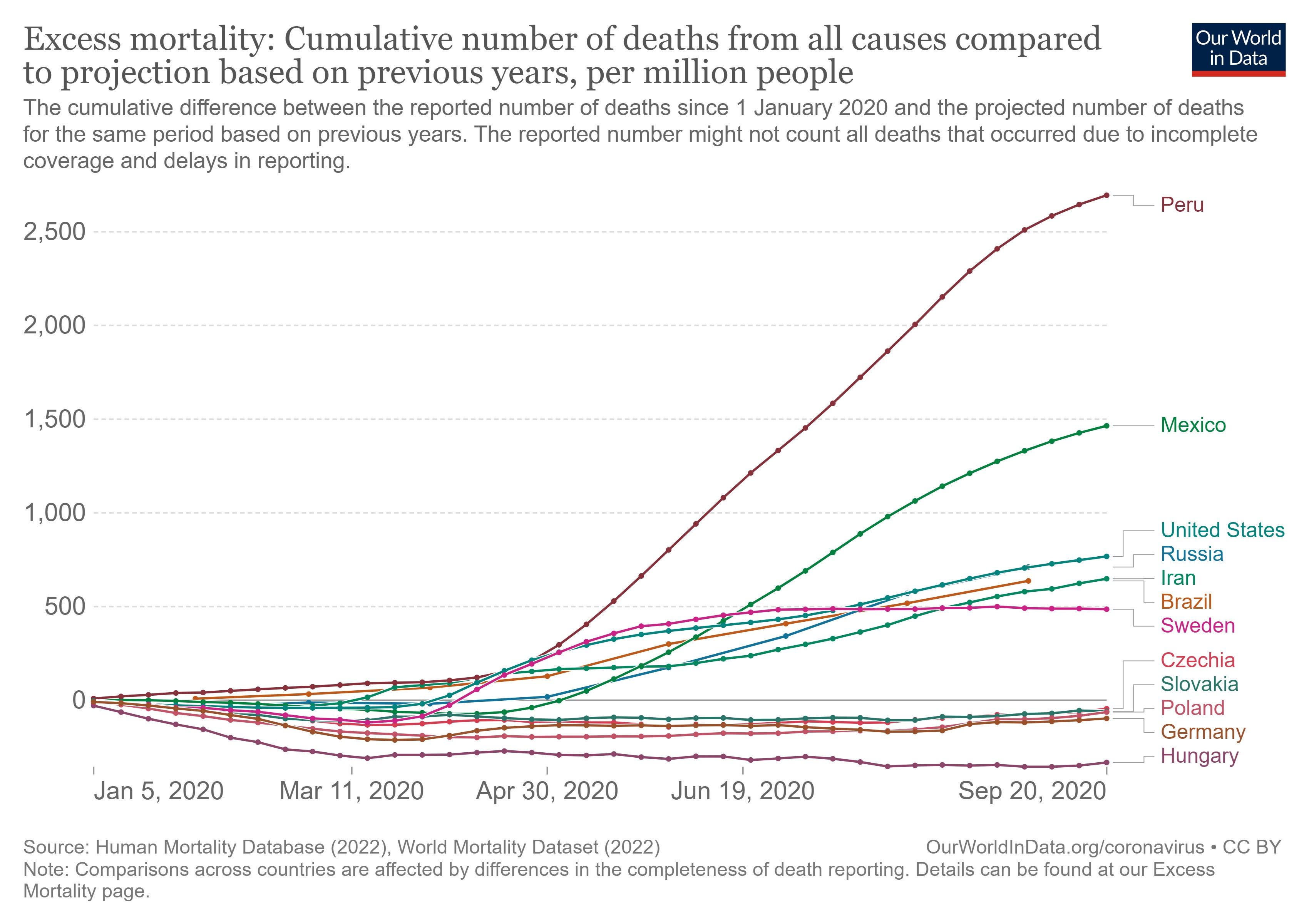
Let me close with one last observation. Let’s return to country-level data compiled by ourworldindata.org. In the early going the “Visegrad” countries of Poland, Czechia, Slovakia and Hungary had the appearance of performing very well (as naïvely measured here by excess mortality per million) as of September 2020. Hungary, the blackest of the bêtes noires of the European Union, even had the appearance of outperforming Germany. But, one never heard anything about Hungary’s performance, … nor that of the other bêtes noires, Poland, Slovakia and Czechia. Those last three countries had the appearance of performing about as well as Germany.
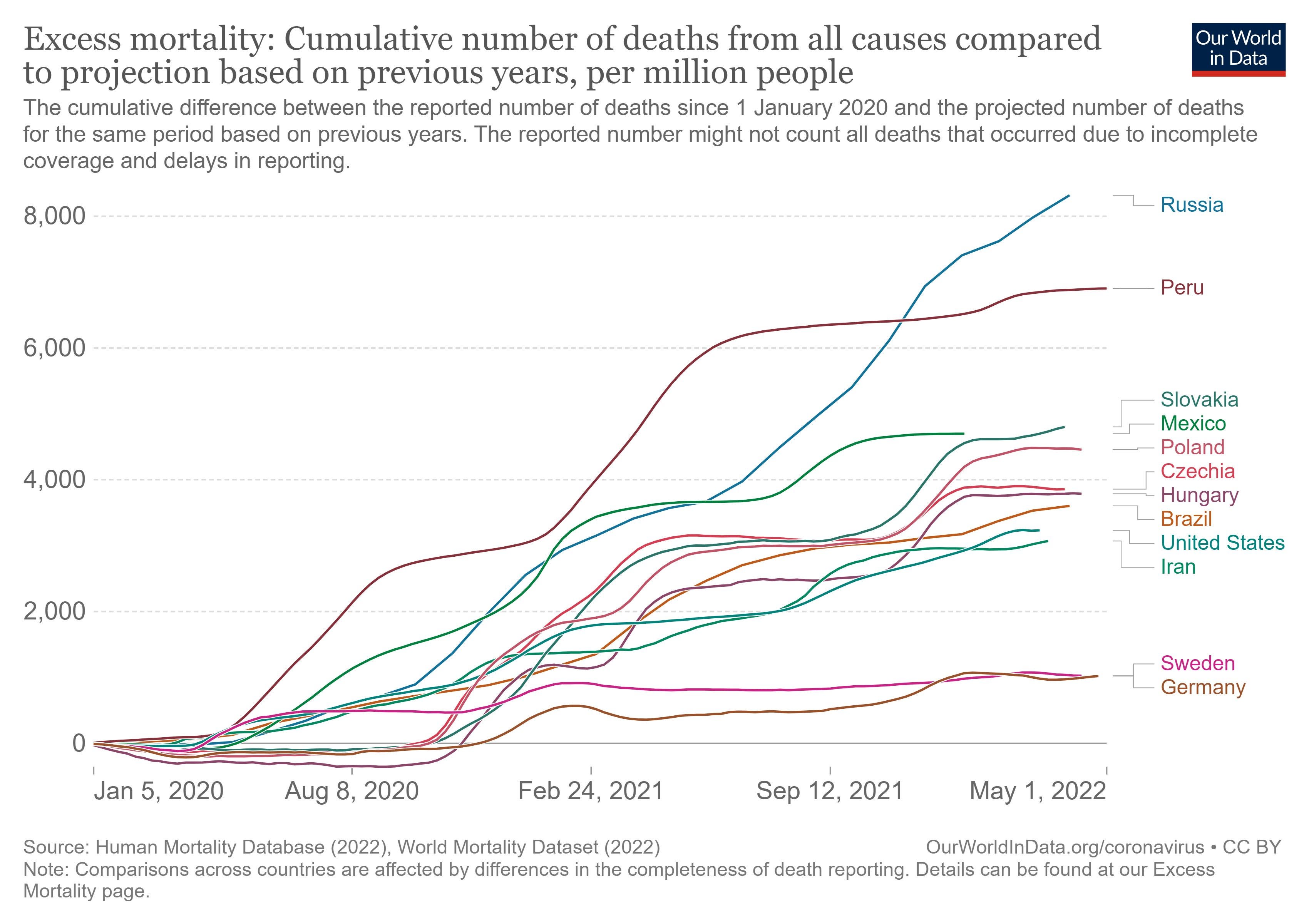
But, flash forward to the present, and the picture changes. In the following graph, Germany (and Sweden) have the appearance of far outperforming the Visegrad countries.
Again, however, excess mortality per million is not as good a measure of performance as proportional excess mortality, because the latter effectively controls for more country-specific differences. So, let’s examine that:
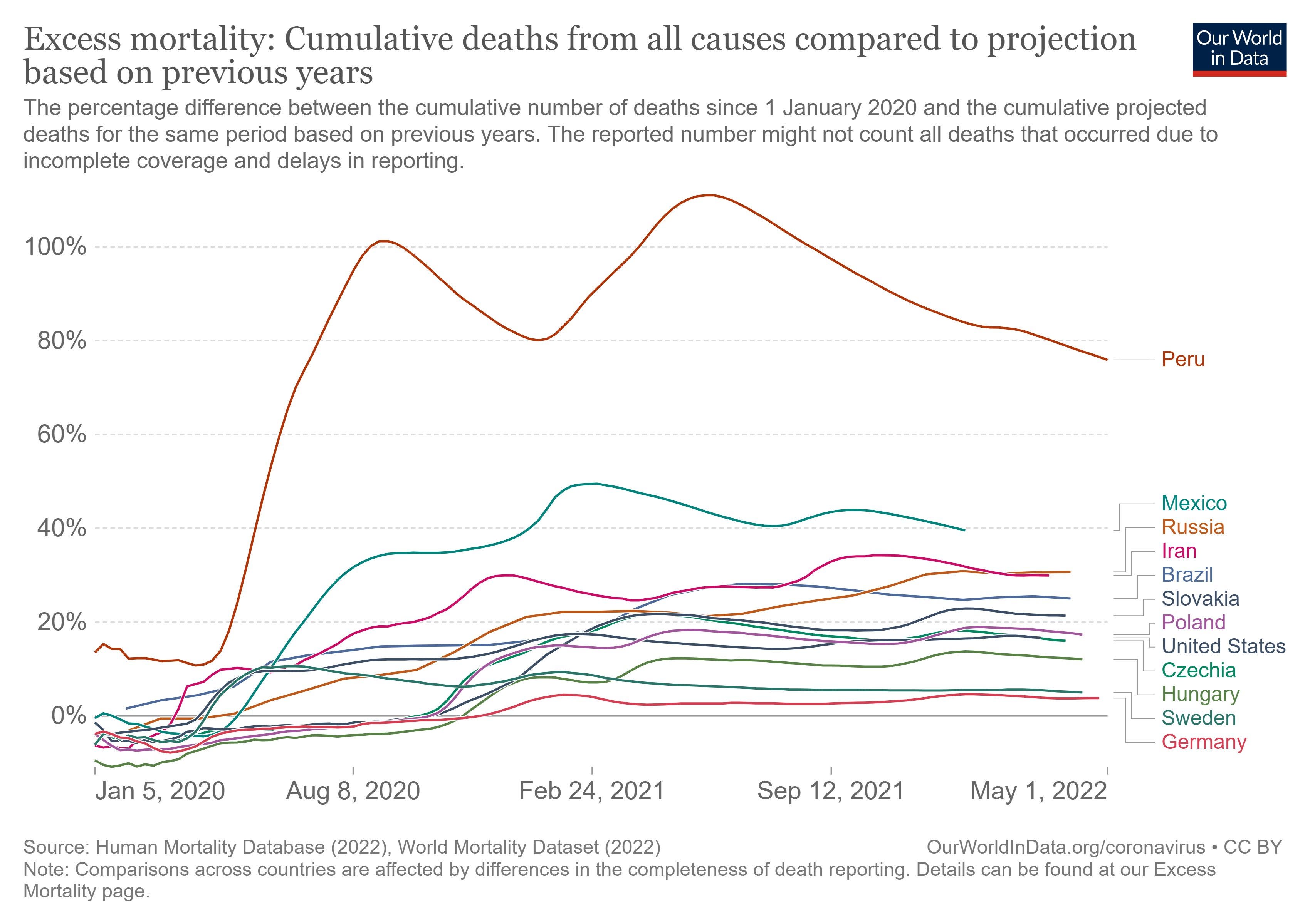
Germany and Sweden lead this pack, but the Visegrad countries now find themselves bunched together around the United States. The Visegrad countries implemented NPI’s of varying stringency, but they all ended up performing about the same. Did NPI’s make any positive difference?
One last graph. This graph features proportional excess mortality for a larger set of countries.
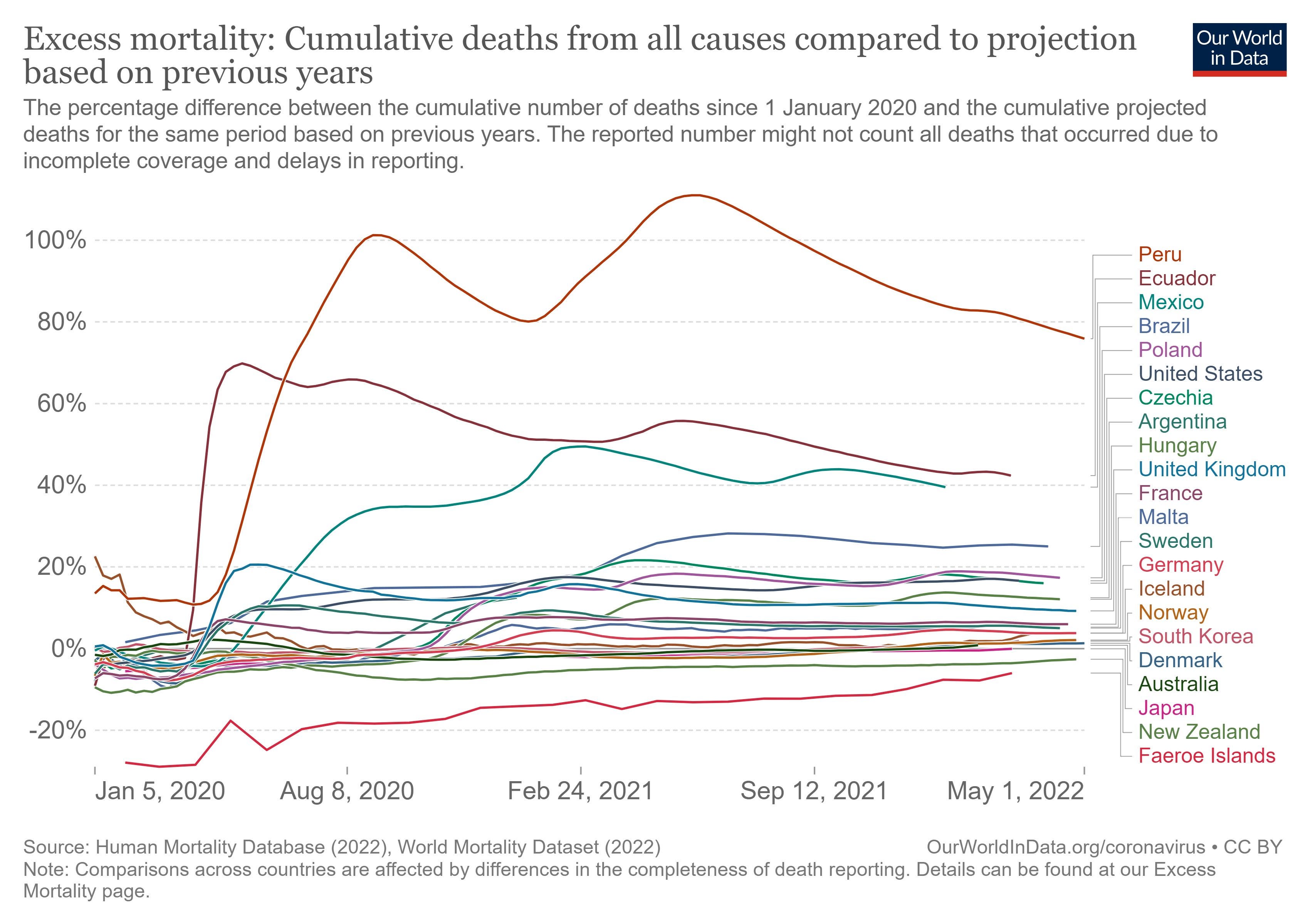
What do we see? We see enormous diversity in performance. And, yet, we still can’t entirely explain this diversity. Not even close. Peru had imposed some of the harshest NPI’s in the world, and yet it appears to have performed the worst. More generally, the countries of South America appear to have performed worse than other countries on average. South Korea and Japan have performed very well with Japan performing better than South Korea notwithstanding the fact that South Korea has imposed harsher NPI’s. But then Australia and New Zealand, countries led by NPI fanatics, have performed better than almost all other countries. But, at what cost? And did the NPI’s work, or were other factors, such as relative isolation important?
In my previous post I featured regression analyses of country-level performance according to which it is not obvious at all that NPI’s had either contained COVID caseloads or COVID fatalities. Indeed, there were strong indications that NPI’s aggravated caseloads and fatalities. But, again, we would like to discern the effect of NPI’s on more comprehensive measures of performance such as proportional excess mortality. There is much variation that remains difficult to understand—and health authorities around the world remain curiously incurious about why there is much variation. Their studied neglect is surely just that: studied, strategic, and intentional neglect.
In an earlier post I illuminated a type of analysis that the CDC or NIH … or anyone with access to individual-level data could conduct. A study would involve computing “hazard rates” as part of a very standard, canned “survival analysis.” A hazard rate is basically a likelihood of a given person dying over a short a short interval. (A day? A week? A month?) One can compute hazard rates specific to all individuals by factoring in age, comorbidities, and, conceivably, other factors. (Education? Occupation?) Survival analysis can exploit data from people who have died as well as from everyone else, whether young or old, healthy or infirm. We could use such analysis to tease out and disentangle the effects, positive and negative, of “vaccinations.” We could use them, potentially, to tease out and disentangle the effects, positive or negative, of NPI’s. But will anyone be compelled to conduct such analysis? … If you all could make me Data Czar, it would happen. As it is, I am just one of us, a fellow trying to put some constructive … structure on the big questions. Just like you.
[1] https://www.npr.org/sections/coronavirus-live-updates/2020/11/21/937445923/andrew-cuomo-to-receive-international-emmy-for-masterful-covid-19-briefings
[2] https://www.epicentro.iss.it/en/coronavirus/bollettino/Report-COVID-2019_10_january_2022.pdf
[3] https://www.epicentro.iss.it/en/coronavirus/bollettino/Report-COVID-2019_16_december_2020.pdf
an all important metric to take a look at, is the development of the average life expectancy during the covid19 episode.
sweden's went up by a couple of weeks to over 83 years.
most of the rest of europe saw it go down.....
In the UK the lockdowns were put forward as a means to stop the NHS becoming overwhelmed. I think they were successful in that but I'd be interested to hear your views on that aspect.